2012 - 2014
Bloomberg Mobile
A cohesive mobile app experience
Problem
The Bloomberg Professional Service is known for its high-contrast, information-dense, multi-screened workstations. This information-rich ethos carried over to the Bloomberg mobile app, an “app of apps” that gave mobile users access to Bloomberg Terminal functions on the go.
My task was to deliver a consistent navigation experience across iPhone, Android, and Blackberry devices that embodied “The Bloomberg Way,” a core company motto. This principle tested our team's collective design skills, as mobile platforms had each evolved distinct user experience guidelines.
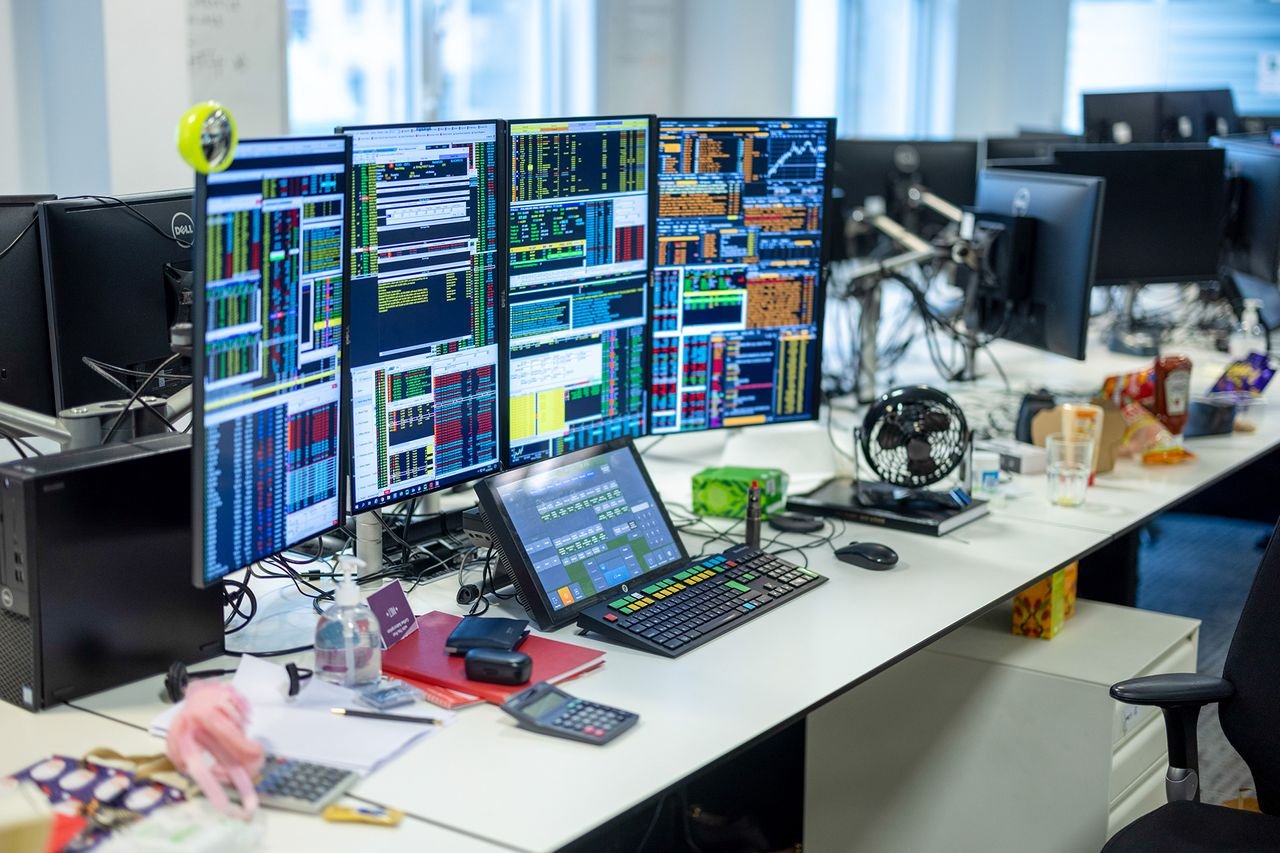
The Bloomberg Terminal
Roles
Product design lead – I spearheaded the design of a cross-platform mobile navigation framework that ensured a consistent experience across multiple mobile platforms. This design improved the navigation of deeply-nested Bloomberg functions on mobile. Additionally, I developed multiple iPad solutions, including a family of aside elements adopted by the Bloomberg Professional Service’s flagship desktop product.
Facilitator – I fostered collaboration between two design agencies and our in-house design team to deliver a comprehensive cross-platform design solution.
A Unified Mobile Navigation Framework
I spearheaded the design of a unified mobile navigation framework that ensured a consistent mobile experience across platforms.
I explored multiple variations of the hamburger menu pattern for the 15 deeply-nested Bloomberg functions of the Bloomberg mobile app.
One pattern condensed the top-level in the hamburger menu for better use of screen real estate. Another used a multi-level drill-in modal.
Ultimately, I proposed a tab navigation solution with customizable shortcuts linked to content deep within the nested hierarchy.
I also tackled other navigation challenges, such as multitasking.

V1: A drilled-in hamburger menu pattern

V2: A dual-level hamburger menu pattern

Original: The Bloomberg Mobile "mega-app"

V1: A drilled-in hamburger menu pattern

V2: A dual-level hamburger menu pattern

A mockup of V2, the dual-level navigation pattern

v4: Tab navigation with a customizable home tab
From Mobile to Desktop
I designed a collection of aside elements for the Bloomberg iPad app.
I delivered a deck showing the elements in different contexts and configurations.
This mobile-first pattern was adopted by the NEWS app on Bloomberg’s flagship desktop product, and I was asked to translate this collection to the desktop context.

I started with a simple aside element to the right of the content.

For the mobile NEWS app, the aside element showed information related to news articles.

Bloomberg's desktop NEWS app adopted this mobile-first pattern.
Thank you
Questions & Answers
From Desktop to Mobile
I translated Bloomberg's World Credit Default Swap app from desktop to mobile.
The design attempted to make the best use of space without feeling cramped.
I delivered designs for the iPhone and both iPad orientations.
The iPhone app was released in 2014.

WCDS app on the desktop

I translated Bloomberg's WCDS app on the desktop to the iPad and iPhone.

The iPhone WCDS app in wireframes
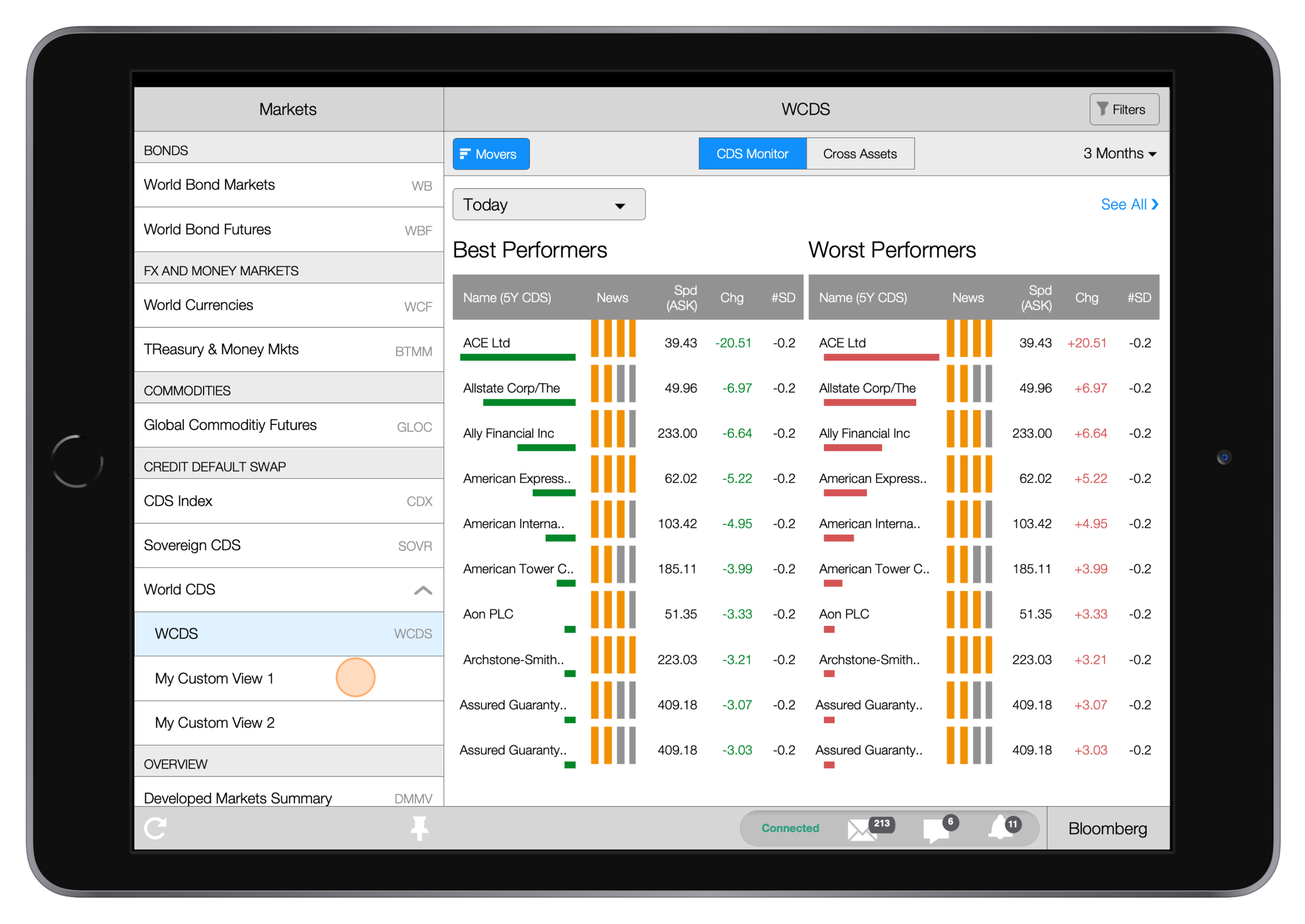
The iPad WCDS app in landscape orientation

The iPad WCDS app in portrait orientation
Lessons
Focus on user goals – I facilitated brainstorming and review sessions between in-house and agency designers. Strategies included forming smaller groups, structuring sessions by themes instead of platforms or teams, and evaluating solutions' tradeoffs to avoid groupthink.
Foster collaboration – Conflict is inevitable when two competing design agencies work together. I agree with Ideo's company value of making others successful. When a collaborative mindset is not emphasized, the team fails to create impactful changes. Motivation switches from creative to defensive, and team members spend their efforts promoting or fighting biases instead of working together.
Next: